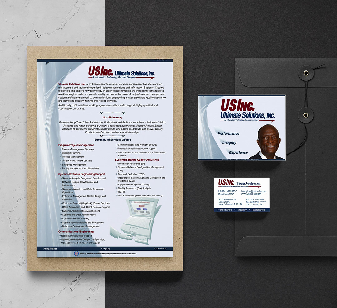
USInc. Flyer, Postcard and Business Card
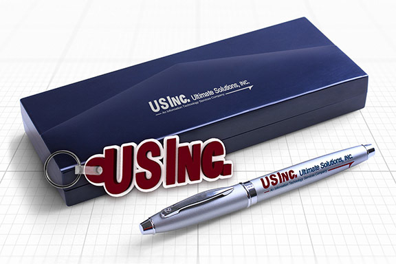
USInc. Pen and Key Chain Give Aways

USInc. Poster on Easel

USInc. Water Bottle
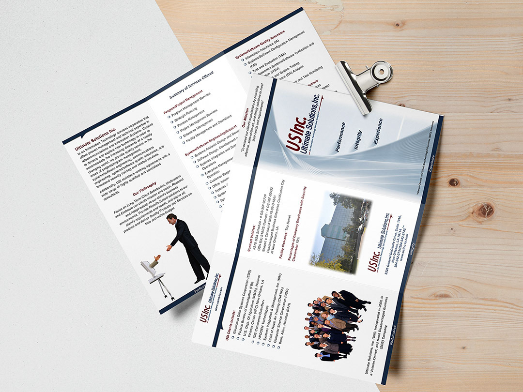
USInc. Tri-fold

USInc. President/CEO Business Card
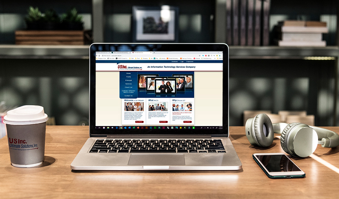
USInc. Website
This project was a re-branding to give the company a fresh look. I took the project over from another company who insisted on doing what they choose even when the client didn't agree. His old color scheme was three shades of burgundy, so I took it back to the mid-tone burgundy from the red the previous company used and helped the client choose a coordinating blue.
I provided the client with three options, all the same color scheme but different styles. He chose the moderate style which was professional, clean and simple. As I created the various items I stayed with the chosen style while gently pushing him out of his comfort zone and introducing more imagery and interest.
